
ART DIRECTION | BRAND IDENTITY | TYPOGRAPHY | VISUAL DESIGN
Femme Builds & Design
I art directed the rebrand to reflect feminine strength, earthy elegance, and architectural precision, drawing inspiration from high-contrast typography and the natural tones of the American Southwest.
—
The project included:
• Developed the visual identity concept, balancing structure and softness
• Selected and refined typefaces to reflect femininity with bold architectural form
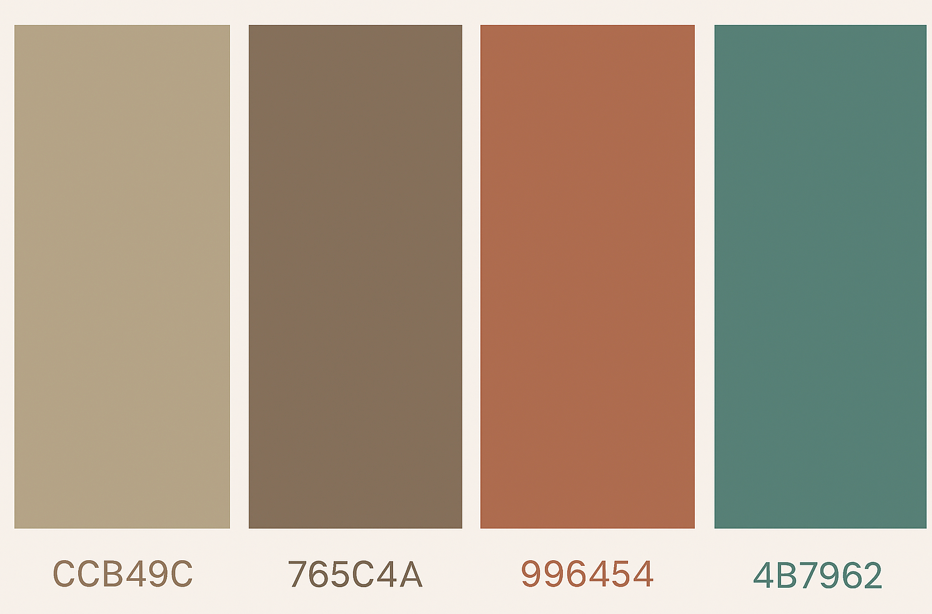
• Curated a custom earthy color palette inspired by terracotta, clay, and muted turquoise
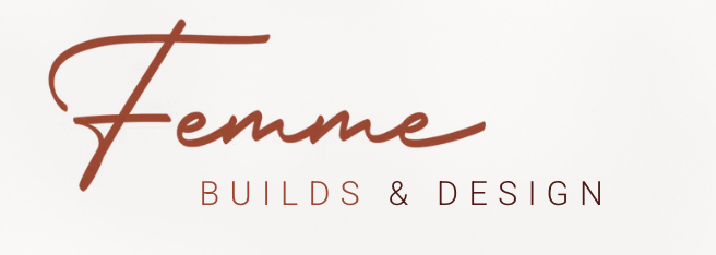
• Redesigned the primary logo with editorial serif typography for modern elegance
• Created a submark system and mockups for website, social, and packaging
Femme Builds Project
Femme Builds & Design is a woman-owned architecture and interior design studio rooted in natural materials, minimalism, and bold feminine energy. While the original brand conveyed warmth and approachability, its script-heavy logo lacked the clarity, strength, and architectural presence needed to communicate the studio’s evolving vision.
The challenge was to create a brand identity that embodied both structure and softness—capturing the essence of empowered, intentional design led by women. The solution was a refined and editorial logo system that blended feminine sophistication with earthy, boho-modern aesthetics and architectural precision. The new visual direction maintains a grounded, handcrafted feel while elevating the brand to confidently stand out in a professional design landscape.
Logo Before
Before the rebrand, the original logo relied on a handwritten script that, while charming, didn’t fully capture the strength, clarity, or architectural essence of the Femme Builds & Designs vision.
Typography Exploration
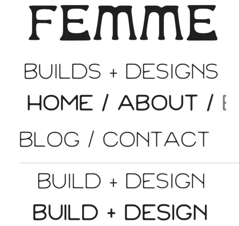
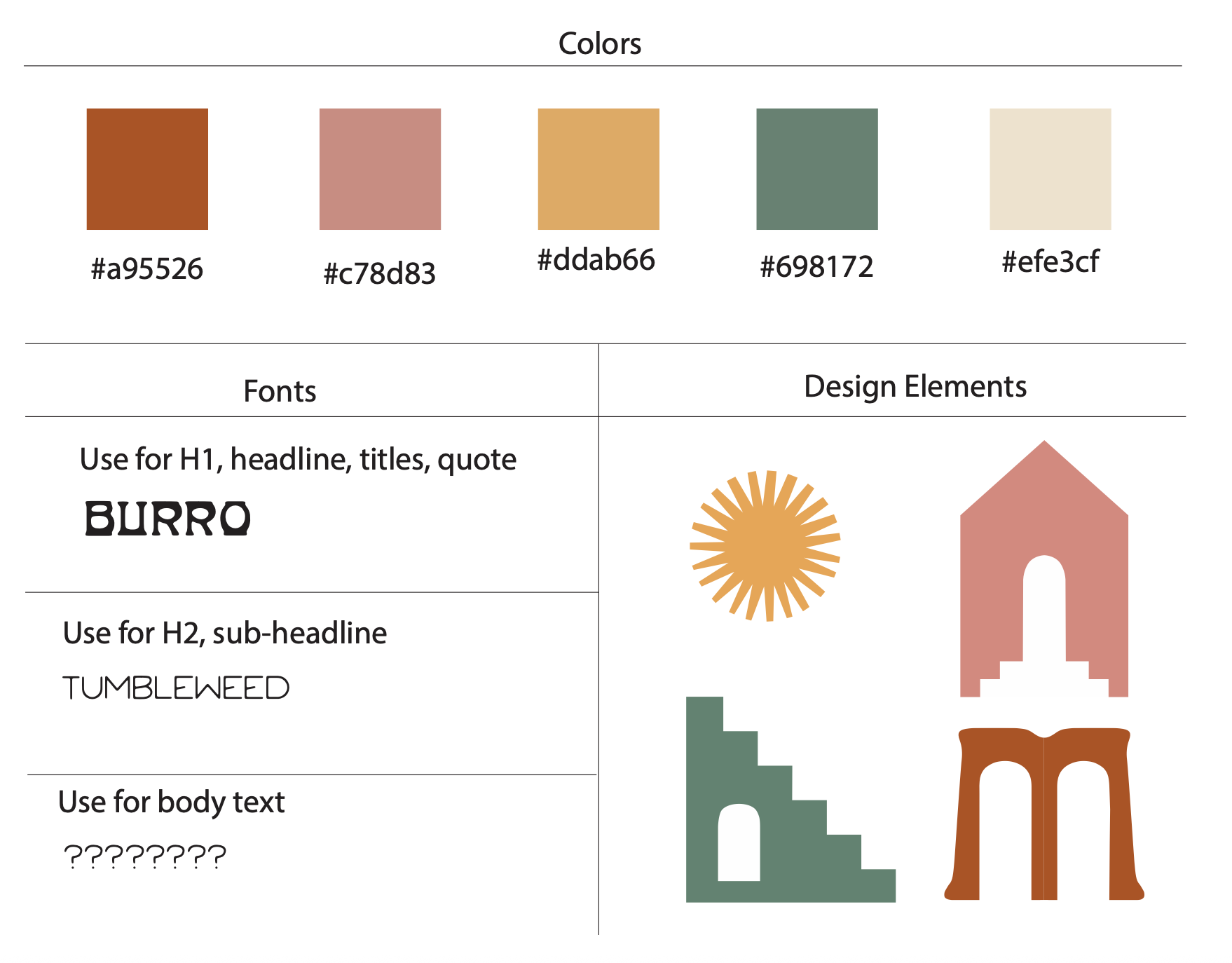
The identity began with type exploration to reflect the brand’s unique personality—feminine, grounded, architectural, and bohemian. The challenge was to find a display font that balanced softness and strength while feeling rooted in natural forms.
- Burro was chosen for the main logo type: a playful, retro serif with organic curves that reflect adobe-style architecture and hand-built environments.
- Tumbleweed, a geometric monoline font, supported sub-headlines and navigation text with a modern desert charm.
- A sans-serif body font (TBD) was explored for web readability and brand applications.
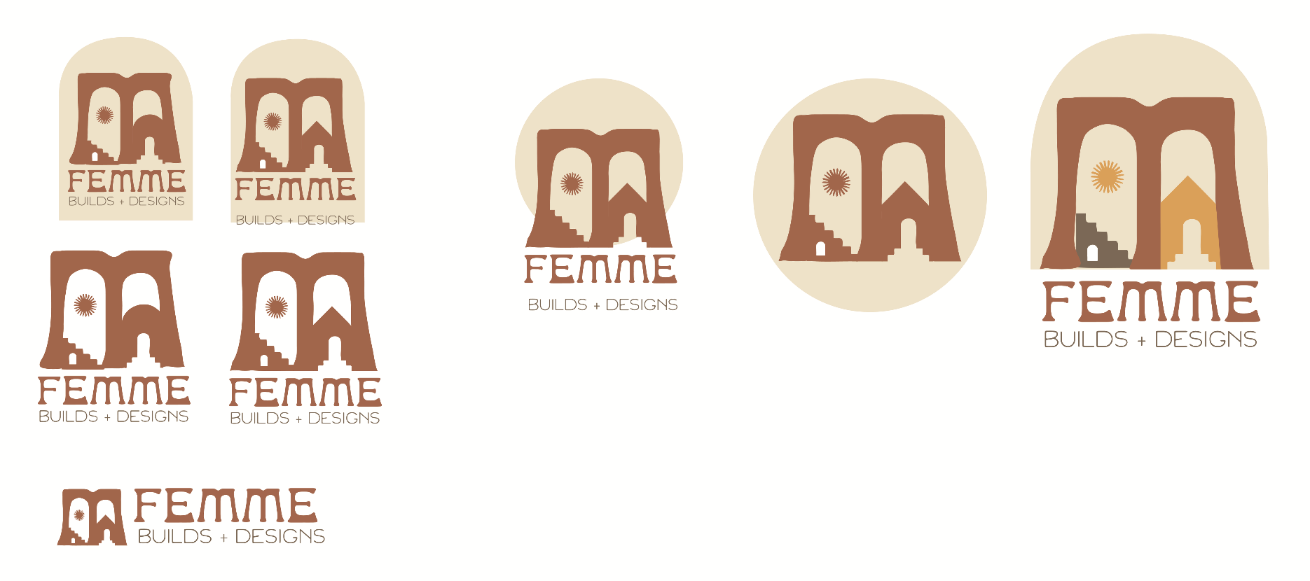
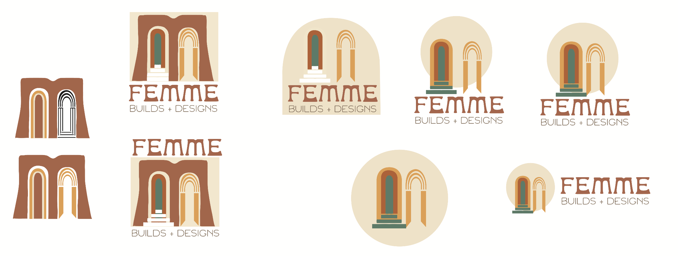
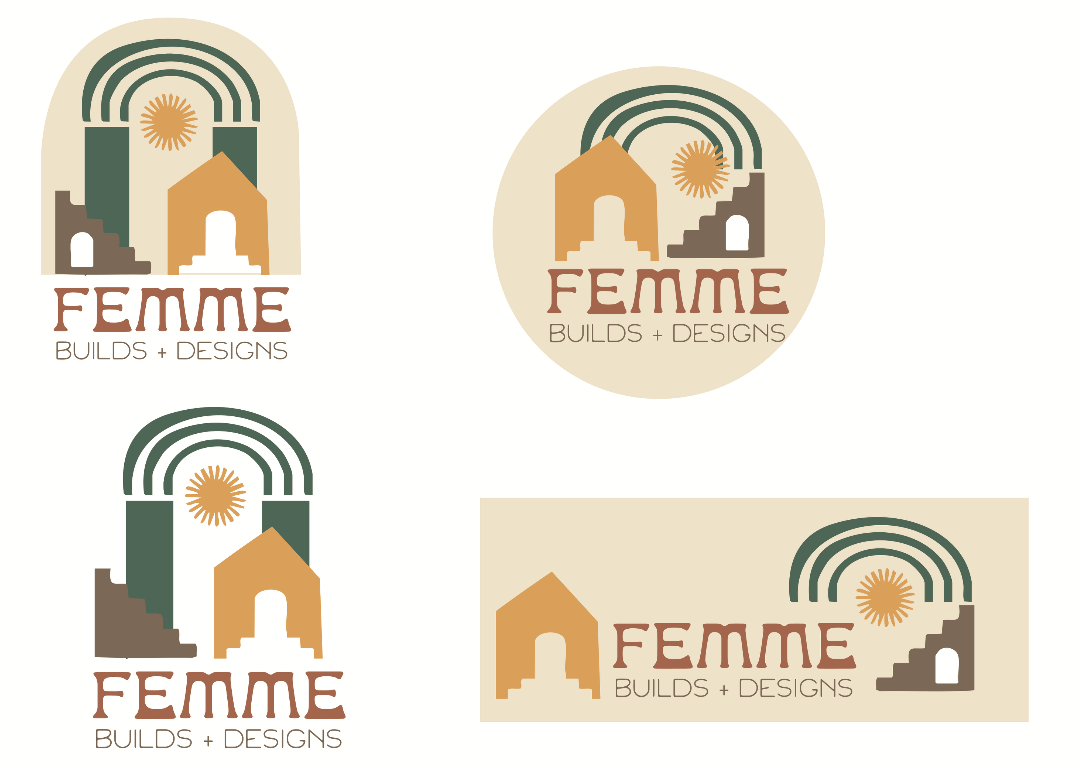
Logo Concept Development
The logo was built from elemental motifs that represent the brand’s values: structure, warmth, femininity, and intentional living. Multiple illustrated icon directions were tested to find the right balance of symbolism and legibility.
The visual elements include:
- Archways & stairs: referencing movement, growth, and sacred space
- Southwestern motifs: including adobe structures, rays of sun, and natural symmetry
- Color palette: muted desert tones—clay, terracotta, sun gold, sage, and turquoise—rooted in the American Southwest and Sedona aesthetics
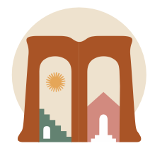
- Modular system: developed for primary logos, submarks, favicons, and use on color backgrounds
Finalizing the Brand System
After several refinements, a final suite of brand assets was delivered to ensure consistent usage across print and digital platforms.
Deliverables included:
- Primary & secondary logos
- Submarks and favicons
- Typography guide and usage
- Color palette codes and mood
The final identity captures the duality of Femme Builds: a brand rooted in craft and storytelling, ready to build legacy through thoughtful design.
Project Recap
The Femme Builds & Designs rebrand was more than just a visual refresh—it was the articulation of a movement. By combining strong, structural iconography with soft, soulful typography and a grounded color palette, the final identity reflects the heart of the brand: women building with purpose, creativity, and connection to place.
This project was a beautiful collaboration between artistic intuition and strategic design thinking. The visual system now allows the brand to show up confidently across platforms—while still leaving room for growth, storytelling, and deeper client connection. It was an honor to bring this vision to life.